Miiriya
Role
This was an individual project in which I planned and directed each step of the design thinking process.
Responsibilities
Conduct user research and usability tests Define the problem Synthesize research, create personas, and construct information architecture (IA) Create visual design of low-fi and high-fi wireframes and prototypes
Duration
December 2023 - February 2024
BREAKING DOWN THE PROBLEM
Research Goals
Identify opportunities for improving branding/identity.
Identify common obstacles or frustrations users have during shopping flow.
Determine the efficiency of the site’s information architecture.
Discover what expectations do users have when using an e-commerce website
Heuristic Analysis
I performed a heuristic evaluation of the site's current condition to understand the webpage and identify problems:
1
Certain accessibility standards are not met such as text hierarchy and WCAG guidelines.
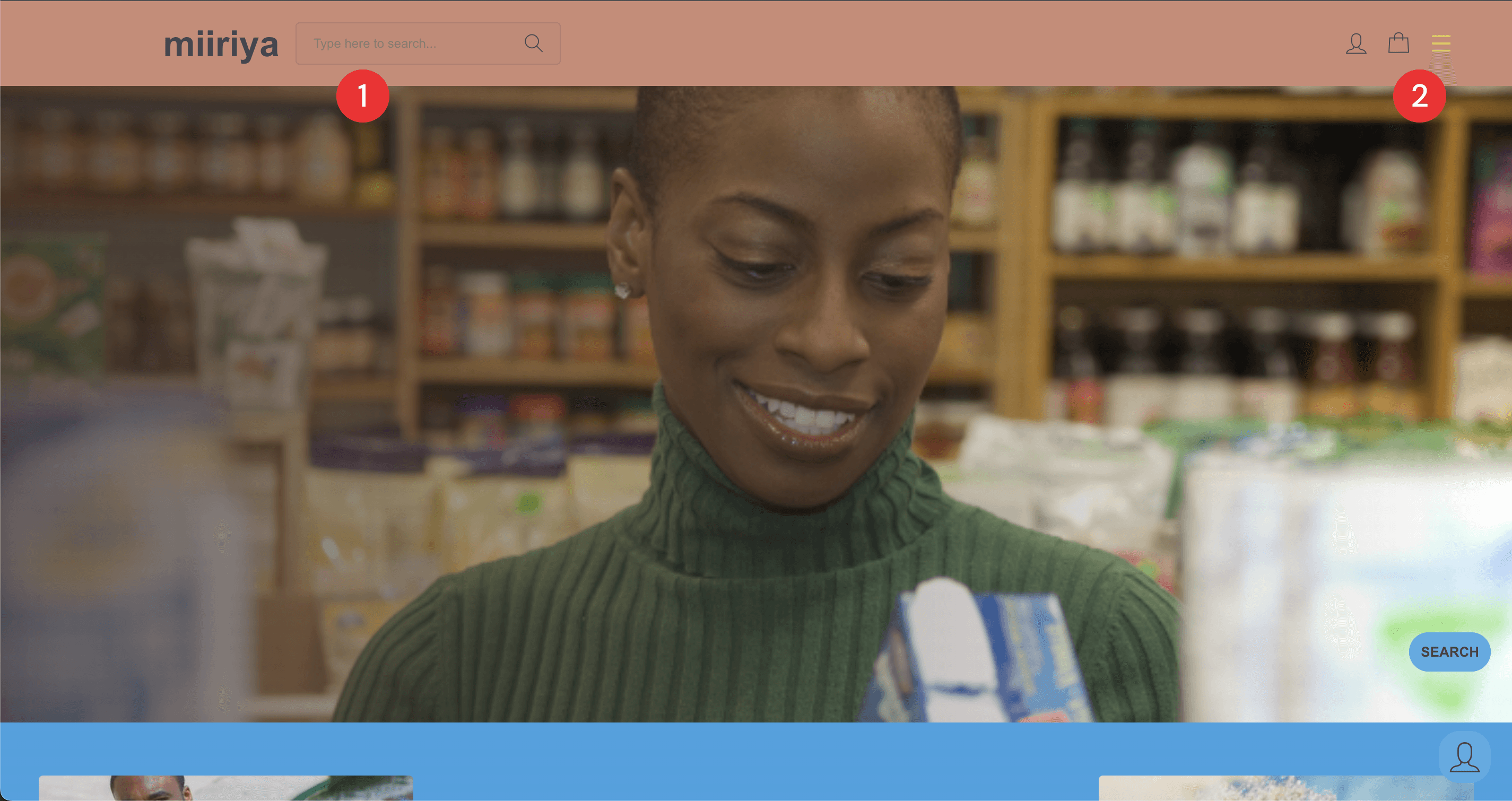
2
The shopping bag and menu icons are not interactive on the homepage.
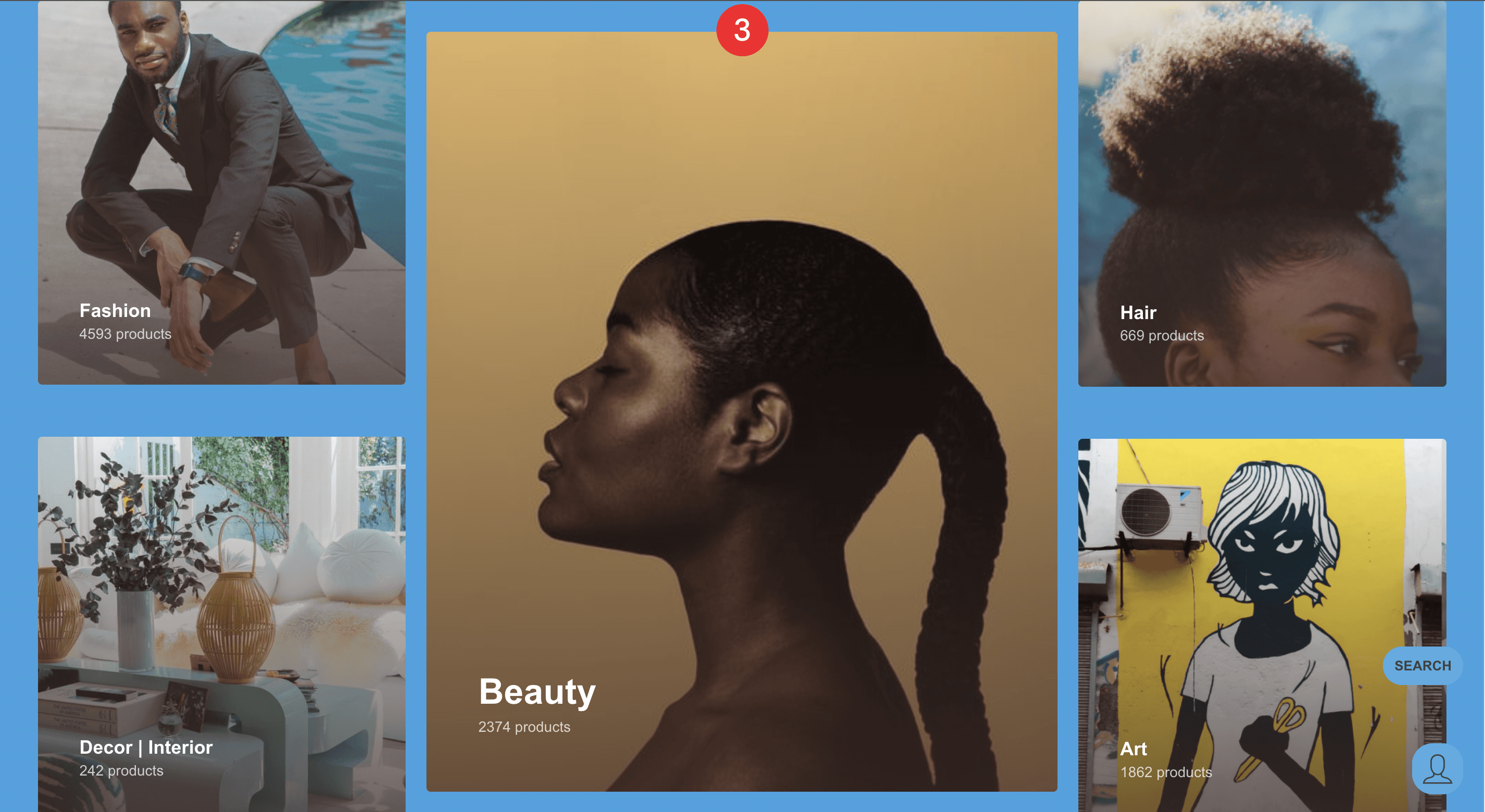
3
The homepage has limited categories to promote further browsing.
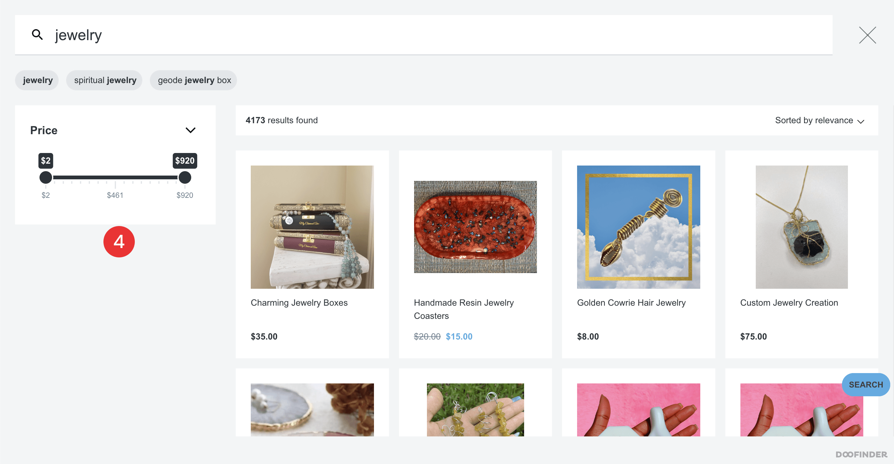
4
The website has minimal filtering choices for refining search results.
5
Throughout the site, buttons often overlap other content and links don't have sufficient spacing between each other and other content on the page.
Usability Assessment
In order to pinpoint opportunities for improvements, I conducted an un-moderated usability study of the live site. My goal was to validate the results of my heuristic analysis and identify patterns and other obstacles encountered by users in their shopping journey. I took note of key performance indicators (KPIs) such as error rate and time on task to compare to my own designs.
UNDERSTANDING THE USERS
Empathy Mapping
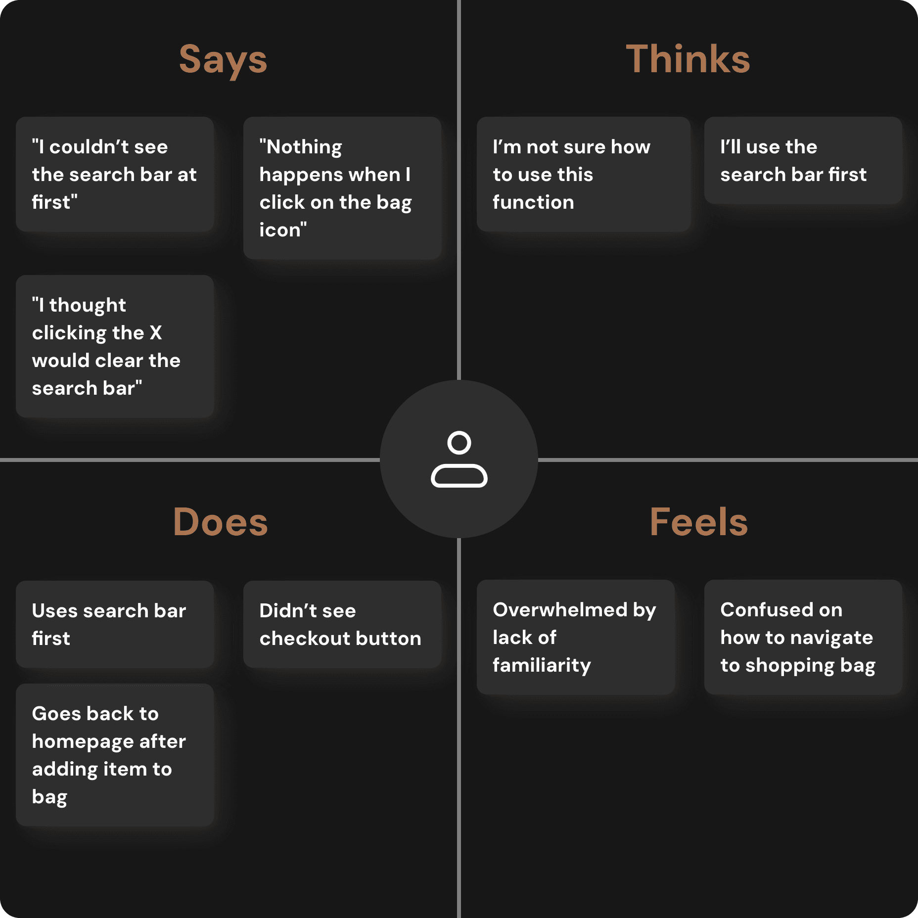
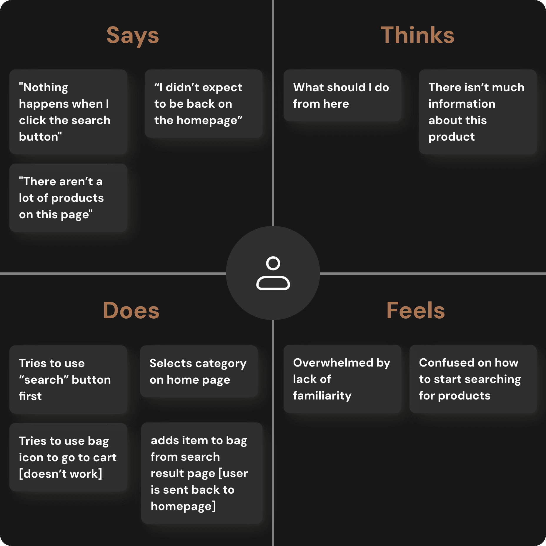
The usability assessment provided valuable insight into the behaviors, thoughts, motivations, and challenges users faced when shopping on Miiriya. I created to empathy maps that represent each user and synthesizes their experiences.
User Persona

Alex
Age:
29
Education:
Bachelor's Degree
Location:
Silver Springs, Marlyand
Family:
Married
Occupation:
Hairstylist
“I love the idea and enjoy supporting small businesses but I wish the website was easier to use.”
Goals
Access checkout from anywhere in the website
Apply filters to obtain more targeted search results
Visit the product page for additional details to make a well-informed purchase decision
Frustrations
Confused about the user flow and navigation.
Overwhelmed by the lack of familiarity.
Identifying Pain Points
1
Navigation
Customers struggle to locate the search bar, creating an obstacle in their shopping experience
2
User Flow
The flow of the website is inconsistent in some places. Users often did not expect certain outcomes.
3
Familiarity
There is an expectation users have when shopping online that wasn’t met by the design and layout of the website
BRAINSTORMING IDEAS
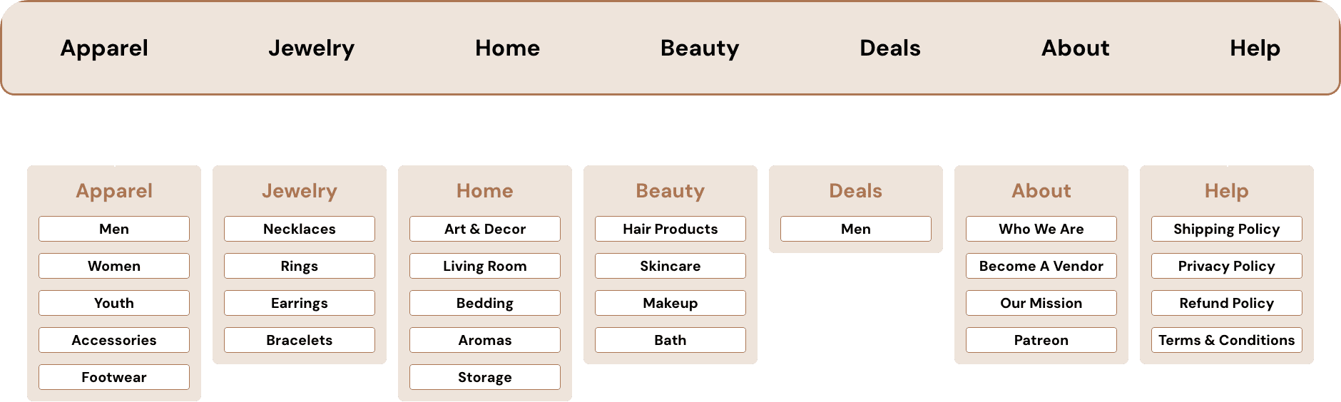
I built a user-focused site map to ensure that my persona could successfully complete their key objectives while reducing any existing pain points.
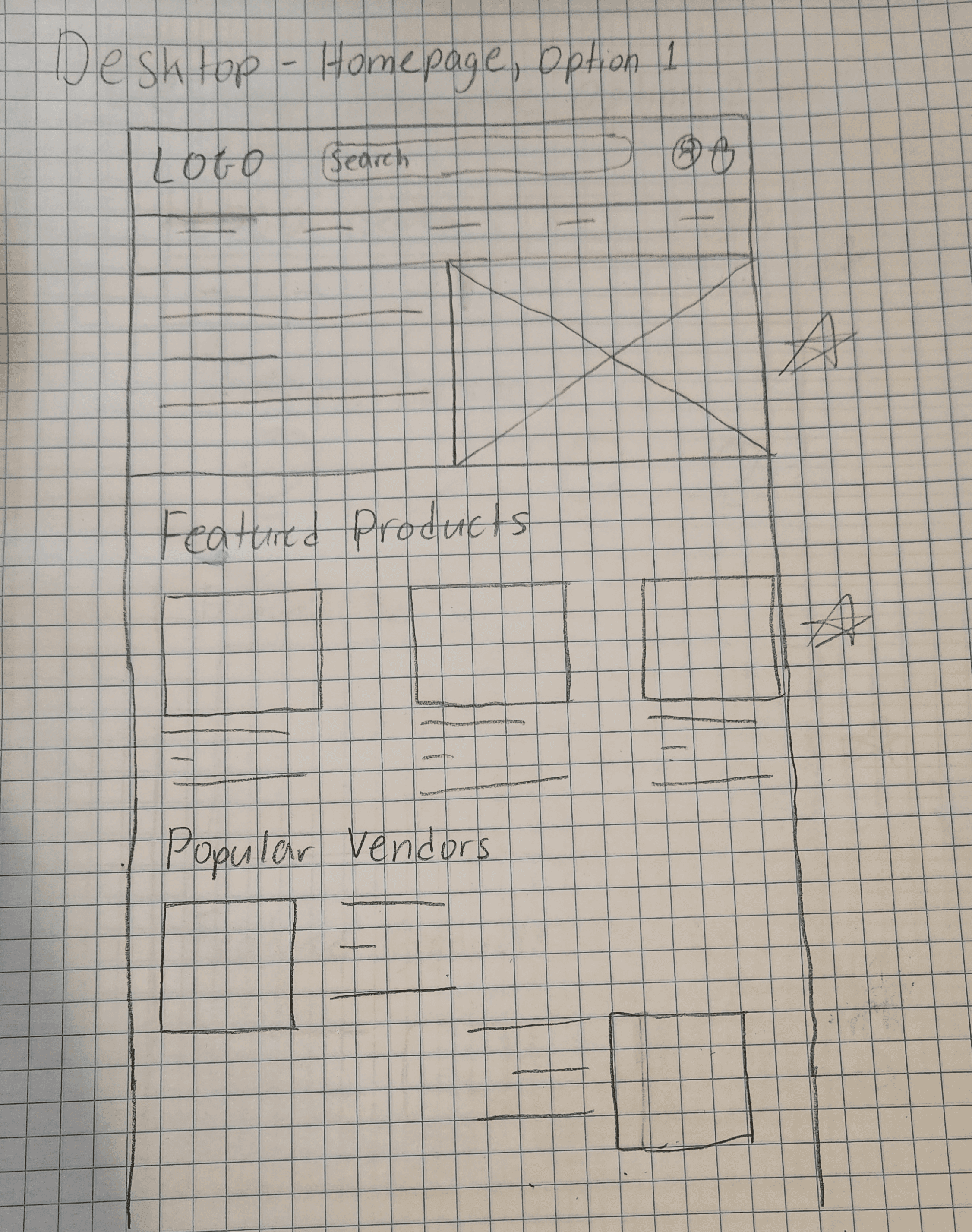
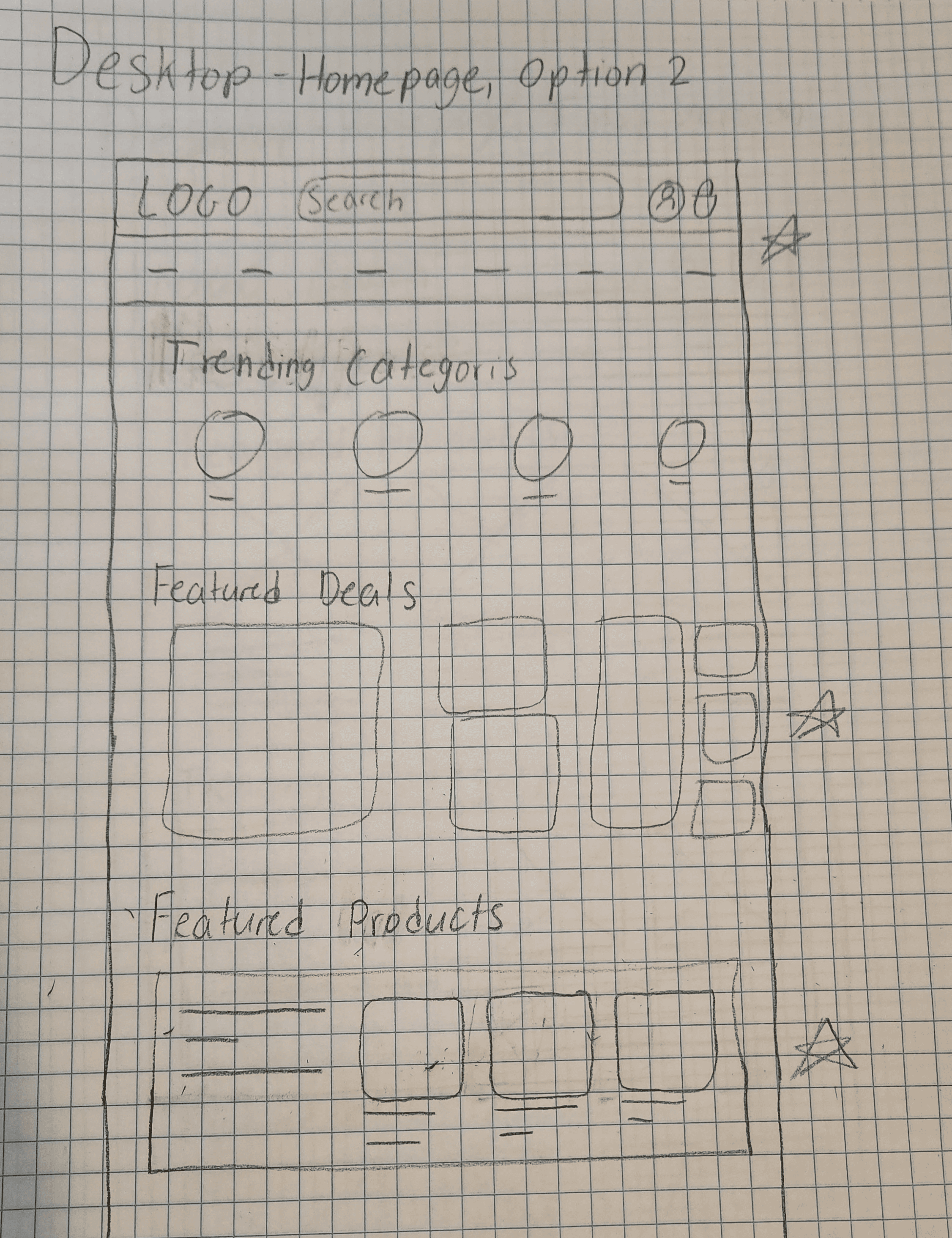
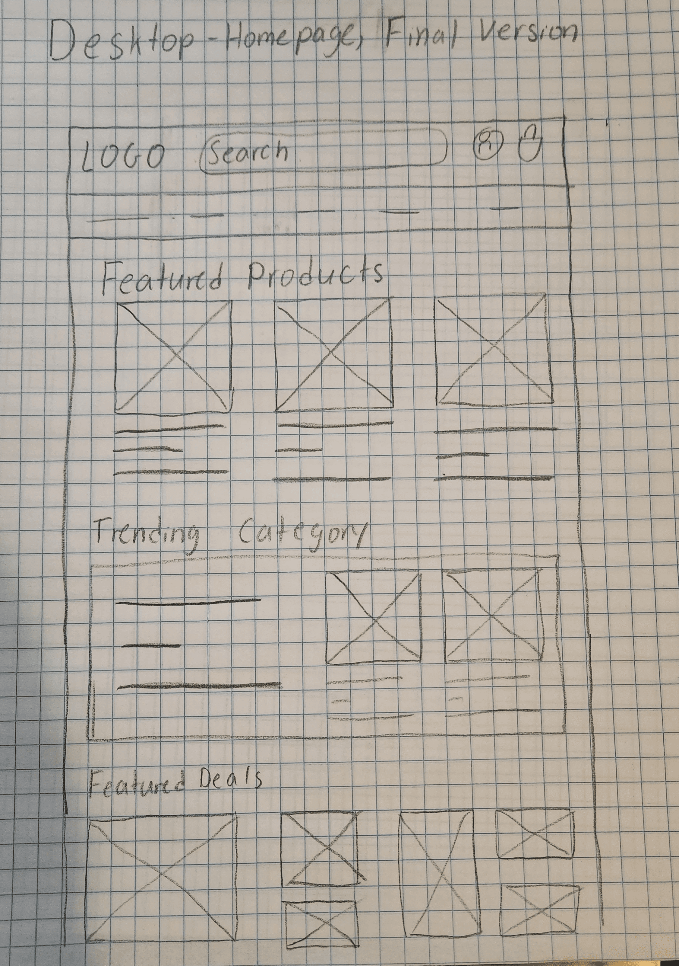
Paper Wireframes
Focusing on the core features identified during user research, I sketched the first wireframes using pen and paper.
I drafted iterations of each screen on paper.
I tried out a few different arrangements before honing in on a final option. My goal was to use different grid layouts to create some visual interest. I decided to include the bento grid that has been a trendy design option for many websites recently.
I utilized the graceful degradation approach to prioritize the website design. After deciding on what I wanted to homepage to look like, I sketched out additional screen sizes to make sure the site would be fully responsive. I repeated this process for other key pages.
Digital Wireframes
Using wireframes, I put my ideas on paper first and then started to make high-fidelity wireframes. After dozens of iterations, these are the wireframes that best represented user flow and met user needs.

COLLECTING FEEDBACK ON INITIAL DESIGNS
Usability Testing
Before moving on to hi-fidelity mockups, I validated the changes made to Miiriya's information architecture and other core functionalities. I tested the lo-fi prototype with the two participants who took part in the original usability test. I paid close attention to how they chose to browse the website and how they interacted with the search and filter functionalities.
One suggestion a user offered was adding a heart icon to products to make it easier to save items while shopping. I also observed that both users were unsatisfied with the checkout process spanning multiple pages and preferred the one page checkout that Miiriya's original site has.
VISUAL DESIGN
Design System
Typography
Color Palette
Branding
Primary
#B5734C
Secondary
#F8F2DC
Neutrals
Background
#FAF9F9
Text
#131A22
Grey
#E5E7E6
Accents
Like Icon
#E93434
Success
#008060
Rating Icons
#FFAC2F
White
#FFFFFF
Elements
Accessibility Considerations
1
When selecting a color scheme, I ensured my color palette adhered to WCAG AA Compliance prior to developing the interface for each display.
2
I implemented a text hierarchy throughout the app. This helps users to distinguish the different sections and information on screen.
3
Typefaces
I used two typefaces: one for the logo and another for all other text. This approach retains clarity of design without making it overly engaging.
REFINING MY DESIGNS
Key Screens
Based on the insights from the usability studies, I applied the design changes allowed for information to be filled on a single page, making the checkout process faster.
Based on the insights from the usability studies, I applied the design changes that include a function that allowed users to save items to their favorites without needing to go to the product page.
USABILITY TESTING ROUND 2
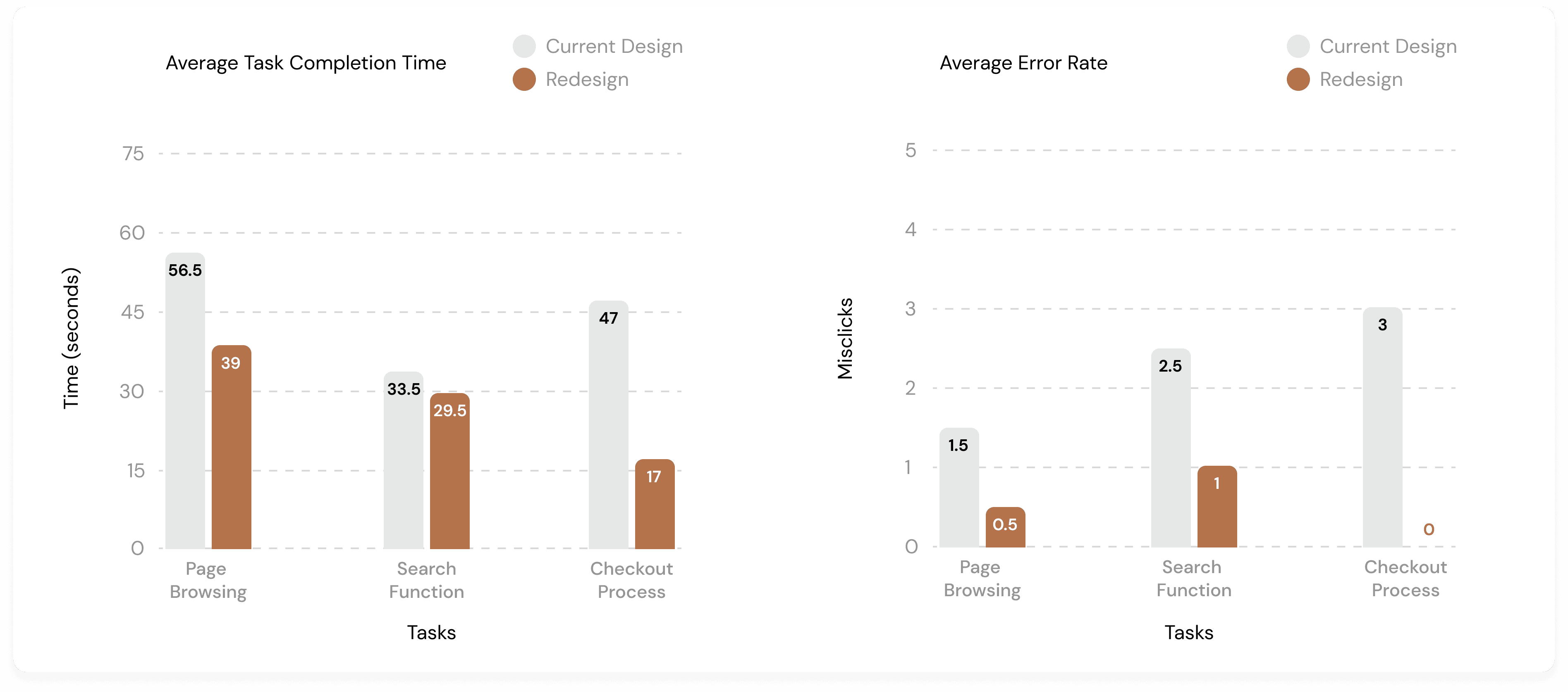
Results
Error Rate and Time on Task
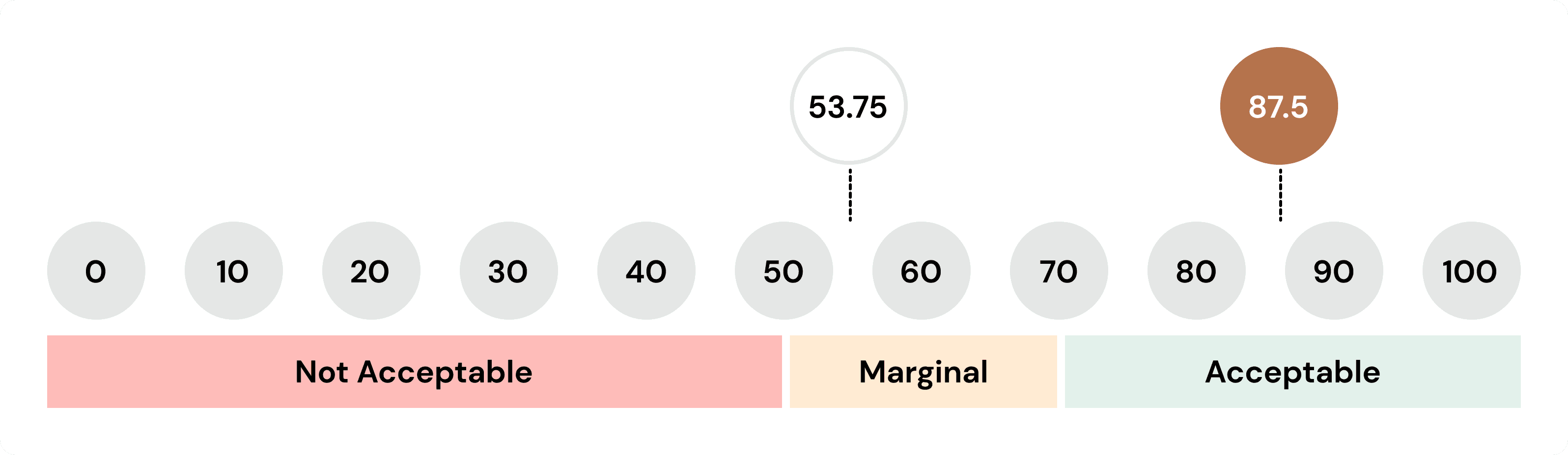
System Usability Testing
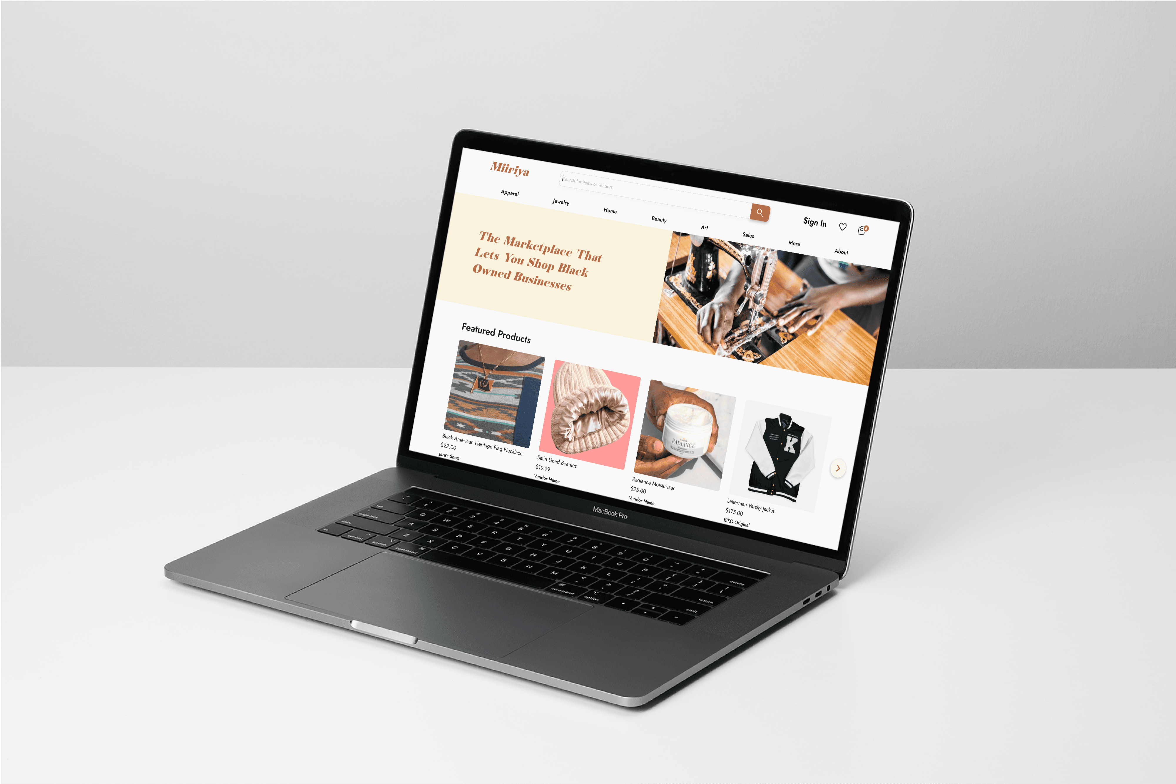
FINAL DESIGNS
REFLECTING ON MY WORK
Impact
With this redesign, visitors should be able to better navigate the marketplace and browse products more efficiently. Furthermore, the brand's values are better displayed, allowing Miiriya to stand out in the saturated e-commerce industry.
Lessons Learned
My key takeaway from working on this project is that different brands require different solutions based on their needs and expectations. It is essential to understand and prioritize the business's needs and values before focusing aesthetic design changes.